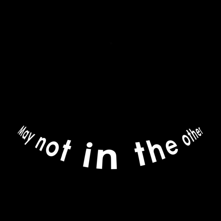
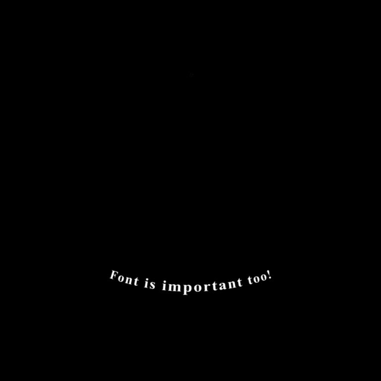
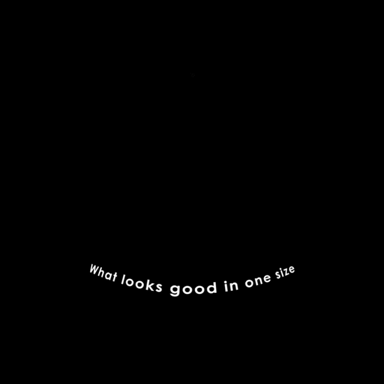
Text treatment can be pretty specific for flat screen, and even more so for working in dome space. Its always good practice to steer clear of serifs, as they can be hard to read on the flat screen. Television and Film this is kept in mind a lot, and should also be something to think about when projecting on the dome surface. We’re currently working on the creation of the credits for our conversion show The Magic Tree House, and learned a couple things from the experience. The distance the credits or text can play a big factor in ledgibility. The closer to the camera the more distortion we see. A good rule of thumb we’ve found is that if you keep the size of the text no larger than one of the cameras (a 90 degree section of the 360 dome), there isn’t much distortion. Another big part to remember is that the resolution of the dome can vary significantly from planetarium to planetarium. Although the text might look really nice and crisp in the 4k version, those planetaria that have 1k domes may not be able to make out the text very easily.